Educative offers numerous types of subscriptions alongside individual courses. I approached the design of the page gives a personalized experience to the users
Design of My Purchases page for Educative | 270% increase in user engagement

Project Tags
My Role
Market Research
Visual Design
Documentation

Team
1 UX Designer
1 Design Manager
1 Product Manager
2 Software Engineers
Types of Purchases Available to the users
Individual Courses
Annual Subscription
Monthly Subscription
Github Student Pack
Track Purchases
Certificate Purchases
Team Subscription Purchases (B2B)
Coming up with Design Goals
If the users have numerous types of purchases, the users should be able to differentiate among the different purchases across all devices.
Giving the user ability to upgrade from a monthly subscription to an annual subscription since Educative’s main business goal is to increase number of annual subscriptions
Enabling the user to cancel annual/monthly subscription before the next billing date.
Data from Hotjar

I went through the most recent recordings data from Hotjar to come up with design goals.
From a set of 62 recordings I saw
26 users had annual subscription active or cancelled
10 users had monthly (multiple) active or cancelled
20-course buyers (few had a lot of courses up to 7)
2 track buyers
Brainstorming and Low fi Sketches
I wanted to make the layout of purchase entry simple and easy to scan. I brainstormed and sketched sample purchases entries, and discussed it with the Product manager and my fellow designers.
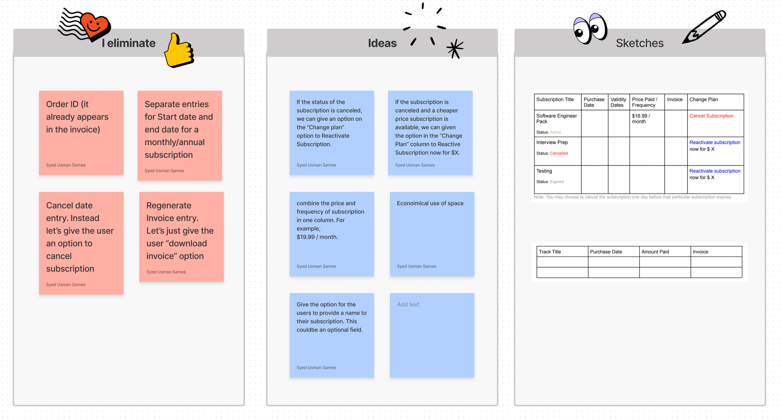
Fig. Some Decisions we made early on when brainstorming and then shortlisting ideas based on constraints
Design Iterations and Decisions
Iteration

Feedback from the team
I discussed the design with the product team regarding how we can improve it. I was provided with meaningful feedback for the next iteration

Different types purchases were differentiated well
Upgrade Subscription and Renew Subscription have been given too much emphasis

The design for Subscription purchases was different from other purchases. It could be made made similar.
A modern UI without vertical lines to separate columns for a table was appreciated
Iteration

Feedback from the team
Upgrade Subscription and Renew Subscription are 2 primary actions so may be just have 1
The download invoice button is small which might which might hinder users to accurately click it (Fitts’s law)
Each purchase cateogory has its own alignment which might not be pleasant to the eye
There is potential for more visual differentiation among different purchases categories
“Edit invoice” Details is at the end which could be missed by the users.
The page will be too long if the user has multiple purchases
Upgrade Subscription and Renew Subscription were given appropriate emphasis
Finalised Design - Iteration

Removal of any primary action here since the primary purpose of the Purchases page is not to encourage CTA.
Bigger Download Invoice buttons so they are easily accessible.
Each purchase category has been given its own tab so the page won’t be too long if there are numerous purchases
“Edit invoice” Details is at the beginning for better visibility.
Each purchase type would have its own visual representation so the user can easily differentiate among purchases
Improved Visual Hierarchy compared to previous iterations
Different Visual Designs for each Purchase Category
Different Visuals for different categories would help users differentiate between different purchases quickly as the human mind tends to scan images quicker than text. In addition, the visuals also establish brand identity for Educative
Course Purchases

Fig. Course Thumbnail image used for courses.
Educative Annual or Monthly Subscription

Fig. Educative logo in a form of badge used for all certificate purchases
Course Certificates

Fig. Educative logo visual used for all content access subscriptions
Team Subscription

Fig. For B2B team subscriptions, 4 hands joined together (to form a team) visual is shown
Case when the user has no purchases

Fig. A visual and CTA to get subscription is provided as Educative business goal is to increase number of subscriptions
Interaction for Edit Details

Fig. There is demand for invoice details since users request it to get reimbursement from companies they work for. Therefore, the edit details for invoices is visible at the beginning of the page.
Mobile Design
Case 1
For mobile designs, if the categories of purchases is 3 or less, I maintained the tab form.

Case 2

If the categories of purchases is 4 or more, I decided to have a dropdown menu. I did not maintained a tab form here since horizontal scrolling would come into play and it is not considered a pleasant user experience. Some of the purchases categories would also be hidden.
Personal Takeaways
I started to think more critically about when and how to use CTAs in different use cases.
Reviewing the user data to gain insights and inform design decisions was a novel experience for me. Through this exercise, I developed a more strategic approach to setting design goals and was able to gain a deeper understanding of user needs and preferences.
Through my research, I have gained a deeper understanding of how to effectively utilize various components in both web and mobile design. I have learned that not all web components can be seamlessly translated into a mobile experience, and I am now equipped with the knowledge and skills to create an optimal user experience for both platforms.
Next Project