Rich Text Editor - Component for Hyland UI Design System

I led the design for the new component in Hyland UI Design System - Rich Text Editor. Hyland UI design system contains more than 65 components that are used across our multiple Hyland products.
Project Tags
My Role
Market Research
Visual Design
Documentation
Team
1 UX Designer
1 Design Manager
2 Senior UX Designers
About Hyland

Hyland is a leading content services provider with a range of cloud-based technologies, solutions and services. Hyland enables thousands of organizations to deliver better experiences to the people they serve.
The design team of Hyland is divided into 3 sub-teams
Design System Team which regularly updates update and create new components
Product Design Team who use components on Hyland products
User Research Team who engages with our clients for testing and research purposes.
The need for Rich Text Editor(RTE) component
Being a content services provider, there are a lot of different types of information stored in the database. In some fields, a user needs to fill a detailed response and if the text is formatted, the text is readable and comprehensive to the person reading it making it good user experience.
Where the RTE would be used?
Some common input fields the RTE would be used in
User/client biographical details
Description of the symptoms in our Health app
Description of what is updated in a document in the Manage version modal
Description of an image, video, document uploaded
Other popular Implementations of RTE
I carefully examined other implementations of the RTE in other platforms and design systems. This exercise helped me understand the expectations of interaction patterns by the end user.
Examples of popular RTE implementations


Takeaways from other implementations
All the formatting actions such as bold, italics, and underline are placed in a straight line

The RTE panel is placed at the top for drafting a lengthy document and at the bottom when the expectation of long paragraphs is low.
A horizontal divider is used to separate the RTE and the text area.

Fig. A screenshot of confluence RTE.
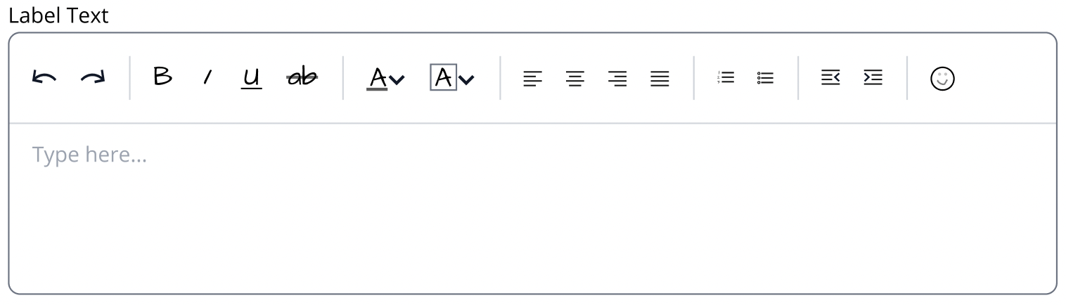
Features in the Hyland’s Design system RTE
The requirement was to design the Rich text editor capability that can be presented with the Form FIeld component to stylize text
Existing Form Field Component

Actions required for RTE in the form of Toggle Buttons
Bold
Italic,
Underline
Strikethrough
Bullets - (numbered and bullets)
Indent and outdent
Text color,
Background color,
Aligning the text - (left, right, centre)
Undo and Redo
Emoji dropdown
Existing Toggle Button Component

Challenge
Make a component which is essentially a combination of 3 components
Form Field
Button Toggle
RTE
Low-Fi mock ups
I designed 3 design alternatives for desktop view and 3 design alternatives for mobile view and presented pros and cons for each alternative to senior members of the design team. I took feedback from them and made changes in the next step accordingly.
Desktop Option 1
This version is most commonly used in numerous online editors and this respects the mental models of users. The top panel will always remain visible.
Desktop Option 2

This version uses a floating Toolbar when a particular text is selected. The toolbar only pops up when some text is selected. This version with little changes can be used in mobile as well.
Desktop option 3

This version is somewhat similar to the version of Alternate 2 but the options are categorized.
Con: In this version, the user would need to click twice instead of once.

Pro: More systematic representation of information and the users would not be overwhelmed when they see 4 or 5 options instead of 15 options (as shown in version 2).
Feedback from the team
Based on the discussion with the senior members of the design team, we decided that we place the action panel below the form field and go from there. The form field can be made scrollable (if the text does not fit in the designated text area) so the user would not have to move the curser a lot to perform actions.

Mobile option 1

This version follows the idea for Desktop alternate 2. A floating toolbar appears when a particular text is selected and limited number of options appear due to less space. Those options are shown that are expected to be used more frequently by the users.
Mobile option 2

The actions that the user can perform are represented above keyboard. The panel is horizontally scrollable.
Mobile option 3

This version is similar to Mobile alternate 2 but there is no horizontal scrolling since in mobile, horizontal scrolling can be an unpleasant experience. I have set some defaults and introduced dropdowns in this version.
Feedback from the team
Based on the discussion with senior members of the design team, it was mentioned that the current programming architecture would not be able to implement Option 3. In the case of Option 1, there was concern that some text would be covered by the toolbar leading to bad user experience. Option 3 was considered to have the best user experience so we went with it.
High-Fi Mock ups
For High-Fi Mock ups on Figma, I added auto-layouts to the master component so any other designer using the component know how the component behaves in various screen sizes.
Adding Variants
Since the text area component has it own states as well, a total of 60 variants were created for the Rich Text Editor
Calculating the number of Variants
I drew up a table where the columns represented the combinations of elements of the Form field component that were visible (12 cases) or and the rows represented the states(5 in total) of the Form field component.
Total variants = # of elements * # of states = 12 * 5 = 60 states

How the variants work
Anatomy

Spacing - all values in Pixels

An example of Surface Usage - User Bio data

Guidelines - Do’s and Don’ts
To provide developers with some guidelines how to implement this design, I came up with some guidelines.
Do’s
Provide users with tooltips when they hover on a button toggle

Allow users to perform multiple actions on the same text. For example, a piece of text may be bold, italic and underlines at the same time - “I am an example”.
Dont’s
Don’t show scrollbar by default in the Form Field. Only show the vertical scrollbar when the user has filled the form field area with text.
Breakpoints
For different screen widths, I overflowed the complete set of button toggles if it cannot be fully shown in the space below the Form Field.
Example - when the screen width is just below 840px

Rich Text Editor on Mobile
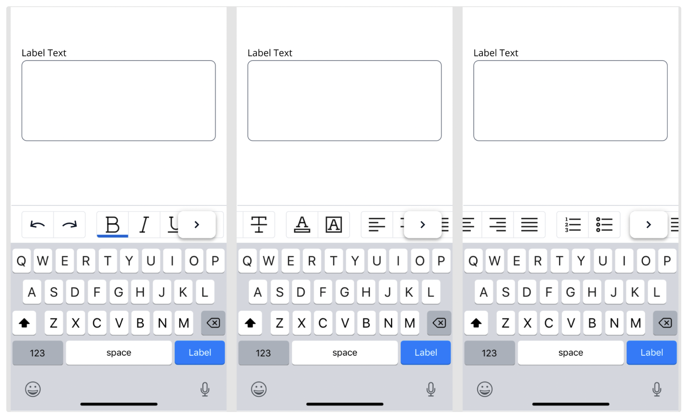
The Rich Text Editor will be displayed above the keyboard and it will support horizontal scrolling so the users may view and apply multiple options. The above image shows the options RTE would show with each tap of a chevron button. The chevron button is shown so the user would know that there are more options available. The user can also scroll by sliding their thumb/finger to the left to view the remaining options
Personal Takeaways
I learnt about Auto-layouts and variants in Figma and how they can make life easier for product designers when they use the component.
I learnt how a new component can be made consisting of multiple individual components
It was the first time I had designed a component from scratch in a systematic design process followed by the existing Design Team.
Next Project