Skill Assessments | 14% increase in User Engagement | 11% growth in user count
I led the design for a new feature request, skill assessment for Educative.
My Role
Project Tags
Visual Design
Competitor Analysis
Design Audit
Interaction Design

Credits
Team
Special thanks to Muhammad Owais (product manager) for extensive documentation and helping with competiter analysis to finalise the features of this project.
1 UX Designer
1 Product Manager
3 Front-end Engineers
1 Senior Software Engineer
About Educative

Educative is an interactive text-based online learning platform for developers. The users who study courses are called Learners.
The courses offered help developers for interview preparation and to grow their skillset.

Learners do not have to download any software to run their code. All the actions take place on the browser.
Users can become authors by creating courses and learners by studying courses available on the platform.
Fig. A screenshot of a course lesson on Educative. The left navigation bar helps user to navigate to different lessons. The content area consists of different widgets that helps display information to optimize learning. For example, the coding widget at the bottom has a “Run” button so the user can see what is the output of the code written.
What is a Skill assessment?
Skill assessment tests user on a specific topic to evaluate the user’s expertise. For example, Figma Fundamentals will evaluate the expertise of the test taker in Figma software. Based on the test performance, a user will be categorized as a beginner, proficient, or an expert. Users will receive feedback on their skill gaps and recommendations on how to close that gap.
Problem
Given 400 courses in the platform, users are unaware which courses they should take that are relevant to them to grow or polish their skills.
Goals
Business Goals
Increase the number of free trials, and annual or monthly subscriptions
Give Educative a better market position against its competitors
Increase product engagement to retain paid users
User Goals
Take multiple tech skill tests and receive feedback on study goals
Measure individual skills in a given technology, identifies gaps, and recommend courses to close that gaps
Targeted User Personas
We wanted everyone who visits our product to try skill assessments so they can learn more about our product and courses they should focus to increase their skills.
The personas can be categorized into 2 groups
1. Non-paying users
Free trial users and Edpresso, blog, and Marketing pages visitors
Logged out users (Skill assessments can be taken by logged out users)
2. Paying users
Annual and monthly subscribers
course buyers
Competitor Analysis
The product manager and I carefully examined how our competitors had designed the skill assessment feature. This exercise helped us what features to include that would help Educative have a better market position against its competitors.
The Competitors


The above platforms
Use adaptive testing in assessments
Share proof of their skill set/certificate on LinkedIn and resumes
Allows the users to share scores or badges on social media

Fig. Assessment results page of datacamp where the level, percentile, and recommendations based on the assessment performance are provided.

Fig. Assessment result page of pluralsight where the skill level, percentile, course recommendations,, user’s strengths, and user’s weaknesses are provided.
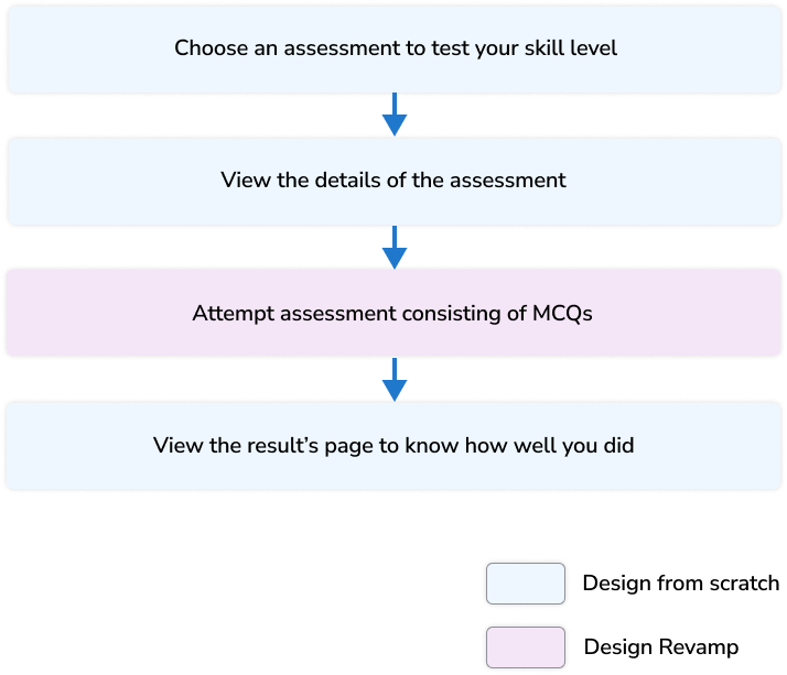
MVP User flow of Skill Assessments
The senior content team members (who prepared questions and times for the assessments), product manager, development team lead, and I brainstormed and shortlisted ideas regarding what and how to include content in our skill assessment feature. We made decisions based on time constraints as we wanted to take this live in 3 months.
Brainstorming and Early Decisions

Fig. Some Decisions we made early on when brainstorming and then shortlisting ideas based on constraints
Concept Visualization / Low-fi Design

After meeting with the stakeholders, I sketched the layout for each page and shared with the stakeholders.
Requirements For MVP And Design Decisions
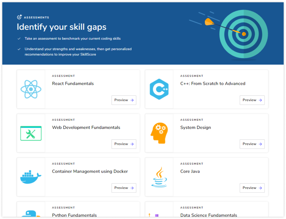
Assessment Homepage
We needed a page where we could
Tell the user what are skill assessments
show the list of skill assessments a user could take
I explored ways how the UI of the skill assessment tile should be. We wanted the skill assessment tile to be different from the path and course tiles because we wanted to brand skill assessments as a separate product of the platform
Skill Assessment Tile
Path Tile
Course Tile


Design Iterations and Decisions for Skill Assessment tile
Iteration

Tile too similar to the course tile that may cause confusion to the users.
Iteration

Title of skill assessment upfront
Description not valuable since any useful detail cannot be covered in a sentence
Iteration

Title of skill assessment upfront
Different dimensions and arrangement of UI elements than that of the course tile
The complete tile is clickable in accordance with UX Fitts’ law.
Removed time since it would be same for every assessment
Assessment Tile Visual Design Breakdown


Final Assessment Homepage

Since Educative is a text based interactive learning platform, we had numerous requests from the users to have a dark mode so there is less strain on the eyes. The design team created a palette for dark mode.
Assessment Homepage - Dark mode
Individual Assessment page
The senior content team members (who prepared questions and times for the assessments), the product manager, and I discussed the requirements on the individual assessment page and the assessment’s result page. The assessment page will include
the CTA “Start Assessment” and Skill assessment details such as duration and attempts
Assessment description
Skill Assessment Badges
Topics covered on the assessment
Courses to prepare to score well on the assessment
Multiple UI design iterations were tested for the individual Assessment page and the Result page. The goal was to present information that is easy to absorb.

Iteration

topics covered section is not easy to read
Too much visual weight was given to the badge being at the center

Iteration
Topics covered easy to read
A lot of empty space on the right of “Assessment Content” (or topics covered) section so we did more iterations.

Iteration
Topics covered section is easy to read and better use of space compared with the previous iteration
“Why take the assessment” section was redundant since it would be same for every assessment
From a marketing point of view and in order to give the user a sense of accomplishment, the badge did not seem prominent in this iteration
Iteration
- Finalised Design for individual assessment homepage

Individual assessment homepage - Dark Mode

Assessment’s Result page
This page will be shown to the users when they have completed the assessment. The result page would include
The user's skill level (beginner, proficient, expert)
What percentage of the assessment was passed
Skill assessment badge and ability to share it on Linkedin, facebook, and twitter
Recommended courses
Scores of the user’s previous attempts
Iteration

“Recommendations” section should come before “My Attempts” section as recommendations are more important.
UI color not consistent with the individual assessment homepage at the top
Iteration

Alignment issues that with the center aligning of UI elements
UI color consistent with the individual assessment homepage
Iteration
- Finalised Design for Assessment’s Result page

Case where the user earned a badge for getting a “Proficient” or “Expert” Skillscore

Assessment Result page - Dark mode

Problems with Existing Assessment’s UI
A few of Educative’s courses have assessments that a user may take to test their learning. Only 52% of the users who started an assessment completed it. The product manager and I decided that we should redesign the UI of assessments because it plays a crucial role in the success of the new feature.


New Assessment UI and Design Decisions

Answer Selected State

Case where the time for the assessment is over

Fig. The above modal appears when the time for the assessment is over before the user could complete the assessment.
New Assessment UI - Dark Mode

Impact
After just 2 weeks of the skill assessments launch, an increase of 14% of the users who attempted the assessment and completed it
78% of the users who completed the assessment opened the course homepages of their personalised course recommendations. 21% of logged out users signed up for educative.
Personal Takeaways
Learnt to teach others how to give meaningful feedback so the changes made in the next iteration are highly impactful
Improved cross communication because I worked with multiple teams in this project including business, content, and product team
Gained understanding of how to balance UI elements on the screen for pleasant viewing experience
Next Project