

Skill Assessments
24% increase in User Engagement | 31% User Growth
Learners at Educative, an online learning platform for developers, are seeking an efficient way to pinpoint the specific skills and concepts they need to improve. By streamlining the process for users to find and enroll in relevant courses, the feature aimed to enhance user satisfaction and drive subscriptions.

Product Designer
Year
Team
1 UX Designer
1 Product Manager
3 Front-end Engineers
1 Senior Software Engineer
Duration
3 months
Deliverables
Competitive Analysis
Design Audit
Wireframes
High-Fi Mockups
Team Presentations
Role
Project Tags
2021
Impact 💸 💸
After just 2 weeks of the skill assessments launch, an increase of 24% of the users who attempted the assessment and completed it

78% of the users who completed the assessment opened the course homepages of their personalised course recommendations. 21% of logged out users signed up for educative.
31% of new assessment-takers became paying users within one month.
Personal Takeaways
Learnt to teach others how to give meaningful feedback so the changes made in the next iteration are highly impactful
Improved cross communication since I worked with multiple teams in this project including business, content, and product teams
Gained understanding of how to balance UI elements on the screen for pleasant viewing experience
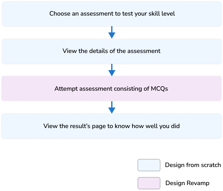
What is a Skill assessment?
Skill assessment tests learner on a specific topic to evaluate the user’s expertise. After completing the assessment, leaners will receive feedback on their skill gaps and recommendations on how to close that gap.
Why do we need Skill assessments feature?
Given 400 courses in the platform, users are unaware which courses they should take that are relevant to them to grow or polish their skills.
Business Goals
Increase the number of free trials, and annual or monthly subscriptions
Give Educative a better market position against its competitors
Increase product engagement to retain paid users
User Goals
Take multiple tech skill tests and receive feedback on study goals
Share proof of their skill set/certificate on LinkedIn and resumes
Who will use this feature?
Everyone who is visiting the platform curious about learning polishing or leanirng new developer skills
Know your Opponents : “What to show” through Competitor Analysis
The product manager and I conducted a competitive analysis of skill assessment features, which informed our strategic decisions for feature inclusion, positioning Educative advantageously in the market
The Opponents


We learnt that the above platforms
Used adaptive testing in assessments
Allowed the users to share scores or badges on social media
Measured individual skills, identified gaps, and recommended courses to close those gaps
From Blueprint to Buzz: Crafting a simple Userflow That Wows!
Finalising “What do show” in a Skill Assessment to increase conversion
Together with senior content team members, the product manager, the development team lead, and myself, we engaged in a comprehensive brainstorming session to pinpoint the most impactful content for our skill assessment feature. Our decisions were strategically guided by the ambition to launch within a tight 3-month timeframe.

Fig. Some Decisions we made early on when brainstorming and then shortlisting ideas based on constraints
Visualizing Concepts for Feedback from Non-Design Experts
After meeting with the stakeholders, I sketched the layout for each page and shared with the stakeholders.

From “WHAT to show” to “HOW to show” on each page
Assessment Homepage
We needed a page where we could
Tell the user what are skill assessments
show the list of skill assessments a user could take
I delved into crafting a unique UI for the skill assessment tile, aiming to distinctively set it apart from the course and Path tiles. Our vision was to brand skill assessments as a standalone product within the platform, ensuring it stood out with its own identity and appeal.
Skill Assessment Tile
Design Iterations and Decisions for Skill Assessment tile
First Iteration


Second Iteration - We want something different from a course tile
Description does not provide any value
Third Iteration - Tile is easily distinguishable

Title of skill assessment upfront
Easily differentiable from a course tile
Tile too similar to the course tile that may cause confusion to the users.
Title of skill assessment upfront
The complete tile is clickable in accordance with UX Fitts’ law.
Bigger icon contributes to aesthetic appeal

Finalised Assessment Homepage
Design Iterations and Decisions Individual Assessment page
The assessment page will include

topics covered section is not easy to read
Topics covered easy to read
the CTA “Start Assessment” and Skill assessment details such as duration and attempts
Assessment description - to give a sense of what the assessment will assess
Skill Assessment Badges - to provide learner with a sense of accomplishment of doing well
Topics covered on the assessment - relevant topics regarding the skill
Courses to prepare to score well on the assessment
First Iteration

Too much visual weight was given to the badge being at the center
Second Iteration - Badge is valuable to motivate user to start an assessment

A lot of empty space on the right of “Assessment Content” (or topics covered) section so we did more iterations.
Third Iteration - Some sections just do not provide enough value

Topics covered section is easy to read and better use of space compared with the previous iteration
“Why take the assessment” section was redundant since it would be same for every assessment
From a marketing point of view and in order to give the user a sense of accomplishment, the badge did not seem prominent in this iteration
Fourth and Final Iteration - Visibility of badge is important

Prominent Assessment title
Prominent Assessment Illustration
Assessment description to set user expectations
CTA and a locked badge to nudge the user to take the assessment and earn the badge
Topics that are tested on the assessment to set expectations
Courses to score well on the assessment. If a user want access to the courses they’ll likely buy the course or subscription so good business outcome
Assessment’s Result page
This page will be shown to the users when they have completed the assessment. The result page would include
What percentage of the assessment was passed
The user's skill level (beginner, proficient, expert)
Skill assessment badge and ability to share it on Linkedin, facebook, and twitter
Recommended courses
Scores of the user’s previous attempts
First Iteration

“Recommendations” section should come before “My Attempts” section as recommendations are more important.
More emphasis on the results required
Second Iteration - Recommendations are more important than Previous Attempt scores

Alignment issues that with the center aligning of UI elements
Second guessing if the results are the most important
Final Iteration - Finding balance between results and recommendations to drive subscriptions

The learner’s or test taker skillscore
Percentage score
Skill Badge and ability to share on social media platforms
Recommended courses that contain lessons from topics that the user got wrong
Scores of the learner’s previous attempts so they can compare their progress
List of topics covered in the above courses recommendations
Existing Assessment’s UI does not work
A few of Educative’s courses have assessments that a user may take to test their learning.
“Only 52% of the users who start an assessment complete it. We need to address the design concerns here to make the Skill assessments feature work ”
Why is the existing Assessment’s UI not working?
I conducted a thorough audit and critically evaluated the existing design to identify its shortcomings. By determining which elements needed to be added or removed, I aimed to enhance user engagement and boost the completion rates of assessments.
Before

The heading is redundant since assessment only consists of MCQs
The coding widget has a black background which makes the left side of the screen visually heavy, causing imbalance
The user has to first confirm the selected answer and press the submit button to go the next question. There is no need for 2 steps when this action can be completed in 1 step
Four buttons are can be distracting for the test taker who are already under stress in completing the assessment under time constraint
Questions button is redundant since user cannot go back to see previous Questions
Selected state too visually heavy
There should not be 2 primary buttons. The current design requires users to move their cursor excessively to submit their answers, which contradicts Fitt’s Law and impacts usability negatively.
New Assessment UI that increased Assessment’s Completion rate by 24%
After

Timer shows seconds remaining in the new version which is important for time management
Light background color of the coding widget so its visual weight does not overpower other elements
I added a light grey background color for options so it becomes easy to distinguish between the question and options
I chose a version of our brand identity color as background color for better marketing
Only 1 action button so no other distractions
Next Project
