Optimizing the experience of GitHub Student Pack users

I led a thorough audit of the experience of GitHub scholars and worked on the problems reported by the users to deliver high impact
Project Tags
My Role
Team
Credits
Design Audit
Visual Design
Documentation
Interaction Design
User Testing

Special thanks to Mishaal Kaazmi (Product Manager) for leading thorough documentation of this project
1 UX Designer
2 Product Managers
3 Front-end Engineers
1 Senior Software Engineer
Relevant User Personas
There are 2 relevant user personas for this project
B2C Annual Subscriber
Users are annual subscribers that gives them access to all content (courses and paths) in the platform
Github Student scholars
Users get access to 68 courses for 6 months by linking their student GitHub accounts with Educative
Problem
Many potential Github scholars are unable to avail the Github Student pack due to a lack of clear instructions. Existing Github scholars complain that they are unable to discover the courses available in the pack.
Goals
Business Goals
Increase the number of GitHub and annual subscriptions

User Goals
Improve the discovery of courses that are included in the Github student Pack
Make the the process of obtaining the GitHub student pack seamless
Problems and Solutions
The product managers and I identified the problems where Github scholars faced and we came up with simple and highly impactful solutions that required less effort from the designers and the software engineers.
Most of the problems were labelled as “Discovery” as users were unable to find the courses they had access to with the Github free subscription.

Fig. The above chart shows the relationship between the effort required by designers and software engineers and the impact of solutions for the users.
Optimizing User Flows
The “Explore” and “Learning” pages are those where the user navigate to the courses they want to study. I created navigation patterns through these pages such that it becomes intuitive to users to discover Github student pack courses.

Fig. Optimizing User Flows for Github user personas through the learn and explore page.
Problem #1
Users complained that they had access to Github student pack courses but could not find them.
Old userflow to find Github student pack courses
The “Learn” page is the first page the user sees after logging in. The user navigates to “My courses” using the left side bar.
The “In- Progress Courses” tab pops up where those courses are found for which the user has completed at least 1 lesson. The user had to go to “All” tab to view all the courses in the Github student pack.

Solution
In another major ongoing project that was happening at the time same, we had combined the “Learn” page and “My courses” page for easy navigation. For GitHub scholars persona, we introduced “My Student Pack” tab so the users can navigate to courses that are included in GitHub student pack in 1 step.

Fig. Added a “My Student Pack” tab for a Github scholar on “Learn” page
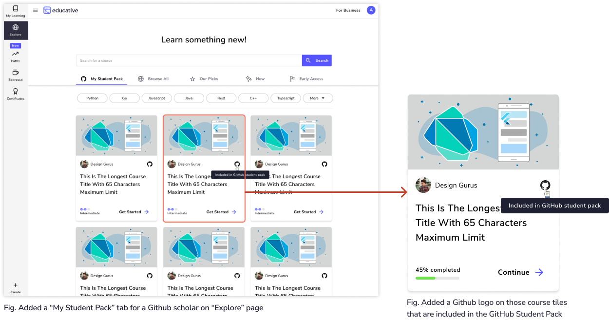
In the Explore page, we also added “My student Pack” tab for GitHub scholars so they can search courses based on topics or tags search.
Problem #2
Users complained they did not know which courses were part of the Github student pack. Every course homepage had a banner that did not convey clearly whether the course was part of the pack or not.

Solution
Mention explicitly if a course is part of the GitHub Student pack on the course homepage.

Fig. If the course is part of the Github student pack, we added banners to mention it and upsell annual subscription (marked in orange).

Fig. If the course is not part of the Github student pack, we took this opportunity to upsell annual subscriptions by giving the GitHub scholars 20% discount.
Problem #3
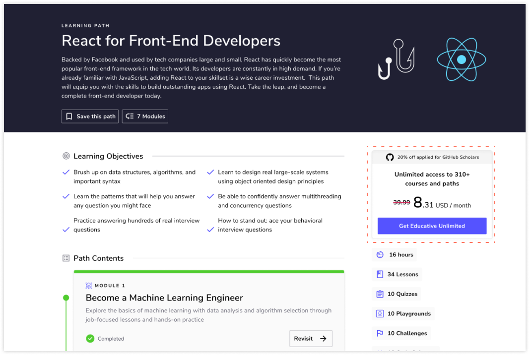
Some users had a misconception that paths are part of the GitHub student pack. Paths are a collection of different chapters from different courses that help achieve a particular learning goal.
Solution
We placed a banner at the top to convey users that they would need to buy monthly or annual subscription to get access to paths. We also took this opportunity to upsell annual subscription and reminding users of the discount(outlined in orange).

Fig. Path homepage
On paths’ homepage, we conveyed users that they would need to buy monthly or annual subscription to get access to paths. We also took this opportunity to upsell annual subscription and reminding users of the discount (outlined in orange).
Problem #4
Users complained that they were unsure if they had activated the Github student Pack. There was no feedback within the platform that the Github student pack subscription is active.
Solution
Feedback was provided to the user in 3 ways
In the form of modal when the subscription was activated

Fig. Added a “banner” on Path page to make clear to the user that paths are not part of the Github student pack.
Placing the status of the subscription in the profile dropdown menu (outlined in orange)

Adding a tile in “My Purchases” page that mentions the status and expiration date of the subscription

Problem #5
Users complained frequently that they were unable to subscribe to Github Student pack courses when clicking the CTA “Claim the offer” and then completing the preceding steps.
Solution
After discussion with the product managers, we decided to revamp the UI of the webpage because the page required numerous UI improvements. As per the aesthetic usability principle, we wanted to increase the credibility of the platform by designing a webpage that contained information that was useful, aesthetically pleasing, and easy to understand for the users.
Data from Hotjar
A screenshot from Hotjar showed that 297 clicks were recorded for this page in June 2021. Using data on how the user interacted with this page, I discussed ideas with product managers about how we can increase interactivity

Auditing content and Visual Design
I audited and carefully assessed every section of the page. I questioned everything in the design and tried to come up with a UI that included all the relevant information required for the users to subscribe in a seamless manner.
Old Hero Section (not designed by me)


Title too long
Get 6 months free is mentioned twice (marked in orange)
Displaying features in a form of a paragraph is not ideal (marked in green)
The illustration is taking a lot of space putting the useful content down the page (outlined in dotted purple)
New Design and Design Decisions
Updated Hero Section
I decided to put the most important information at the top to attract the attention of the users. Using Hotjar recordings, I noticed the interaction of the users with the webpage decreases with increasing scrolling

New Section added - How to get the Scholarship
Since the customer support received several emails from users that they were not able to activate their GitHub subscription, I added this section to give clear and concise instructions.

The images used in this section were screenshots from the webpages the user needs to navigate to avail the subscription.
When the users would see the familiar images, they would feel confident that they are on the correct path to successfully activate the subscription.
New Section added - What you will get with this scholarship
I added a new section to mention the benefits of the GitHub subscription. It would help users to make a decision about being Github subscribers.

Old “Why Educative” section

New “Why Educative” section
Marketing manager, Product manager and I edited the content of “Why Educative” section so users would know the features unique to Educative so it helps us stand out from other platforms. This helps increase Educative’s credibility.

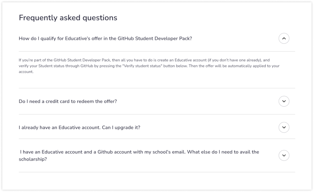
Old “FAQs” section

New “FAQs” section
I standardized the “FAQs” section like found on the rest of the platform. Additionally, we decided to put the FAQs section above the “Why Educative” section because it had more value to the user. The CTA “Verify student status” was removed since it navigated to the same webpage as the “claim the offer” button.
Full webpage and Dark mode
Testing and Results
We showed the prototypes to 8 of our summer interns in the 3rd and 4th years of their undergraduate studies. We also asked them to share the redesign of the page with their friends who wanted to get access to the GitHub student pack.
All of them were easily able to gain access to the GitHub student pack.
They also claimed that the new page made them eager to get themselves the pack compared to the old one.
Personal Takeaways
The revamp of the page gave me a lot to learn about how UI elements can be organised to give a pleasing user experience to the user
I learnt how big problems may be solved by simple solutions. Quick wins (problems that require low design and engineering effort but give big impact) help users and businesses faster.
I learnt more about giving users appropriate feedback using design.
Next Project